- Easy hacks for plotting population pyramids in R.
Following the explosion of data visualisations in the context of the COVID-19 pandemic, I thought I’d share some easy and flexible code to plot population pyramids in R.
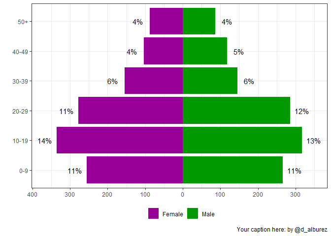
For this exercise, we’ll create a bogus population dataset with population totals by age and sex, including a column to indicate the fraction that each group is of the total population.
pop <- data.frame(
  sex = sort(rep(c("Female", "Male"), 6))
  , age = c("0-9", "10-19", "20-29", "30-39", "40-49", "50+",
            "0-9", "10-19", "20-29", "30-39", "40-49", "50+")
  , pop = c(256L, 335L, 278L, 155L, 103L, 88L, 266L, 317L, 286L, 145L, 118L, 87L)
  , frac = c(0.11, 0.14, 0.11, 0.06, 0.04, 0.04, 0.11, 0.13, 0.12,
            0.06, 0.05, 0.04)
)
and explore the data:
head(pop)
##      sex   age pop frac
## 1 Female   0-9 256 0.11
## 2 Female 10-19 335 0.14
## 3 Female 20-29 278 0.11
## 4 Female 30-39 155 0.06
## 5 Female 40-49 103 0.04
## 6 Female   50+  88 0.04
We’ll need three packages from the tidyverse family to plot the pyramid (we’re using ggplot 3.3, so please make sure to have the latest version installed!):
library(dplyr)
library(ggplot2)
library(scales)
and a simple function to determine position of the labels next to the bars:
nudge_fun <- function(df){
  ifelse(df$sex == "Female", (sd(df$pop)/3)*-1, sd(df$pop)/3)
}
Now come the code for plotting. I added comments in the code below. Try adjusting the code to fit your purposes!
pop %>%
  # First, we transforms the columns so that female values show in the
  # left-hand side of the plot, in this case as 'negative values'.
  # I also round some values for convenience.
  mutate(
    pop = ifelse(sex=="Female", pop*(-1), pop*1)
    , frac = ifelse(sex=="Female", frac*(-1), frac*1)
    , share = paste0(abs(round(frac*100,1)), "%")
  ) %>%
  # This starts the actual plotting, first we define which columns
  # have the data that we want to use
  ggplot(aes(x = pop, y=age, label = share)) +
  # Now we add a layer to the plot with the bars of the pyramid
  geom_col(aes(fill=sex)) +
  # Add the labels indicating the percentages
  geom_text(aes(label = share),
            position = position_nudge(x = nudge_fun(pop)),
            size = 4
  ) +
  # Custom colours from plotting, you can change these
  scale_fill_manual("", values = c("#990099", "#009900")) +
  # Now we make sure that all values in the horizontal axis are positive
  scale_x_continuous(
    "", breaks = scales::pretty_breaks(n = 6),
    # Small function to rescale y axis
    labels =  function(br) ifelse(abs(br)>=1000,paste0(abs(br)/1000, "k"), abs(br))
  ) +
  # Here you can add your own captions and axis titles
  labs(x = "", y = "", caption = "Your caption here: by @d_alburez") +
  theme_bw() +
  theme(
    legend.position = 'bottom'
    ,axis.title.x=element_blank()
  )
# You can export this graph to your current working directory:
## NOT RUN
# ggsave(filename = "pyramid.pdf")